样本:
<div class="wrap"><span class="content"></span></div>
基础样式:
.wrap{
         width:400px;
         height:300px;
         max-width:100%;
         border:1px solid #000;
}
.content {
        display:block;
        width:100px;
        height:100px;
        background:#f00;
}
水平居中:margin|定位法
1.margin方法
条件:
- 元素定宽
- 元素为块级元素(行内元素使用block)
- 元素的margin-left/right须设置为auto;
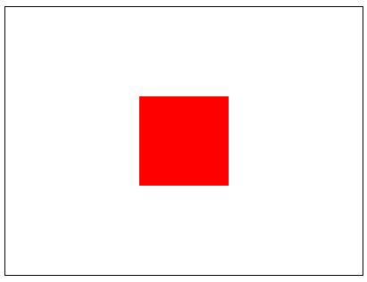
使用margin:0 auto;后的效果如下:
 table-cell垂直居中
1.3-image垂直居中
图片添加vertical-align:middle 属性
.wrap{
         border:1px solid #f00;
}
.content{
       vertical-align:middle;
}
span {
       display:inline-block;
       height:100%;
       vertical-align:middle;
}
 图片vertical-align+span垂直居中
父元素添加text-align:center;即可水平垂直居中
2.视窗单位解决:
.wrap{
       position:relative;
}
.content{
       position:absolute;
       margin-top:50vh;
       transform:translate(-50px);
}
稍微改动实现水平垂直居中:
.wrap{
position:relative;
}
.content{
position:absolute;
margin-top:50vh;
transform:translate(150px,-50px);
}
 使用视窗实现水平垂直居中
注意:元素只能用在视窗中
Flexbox解决方案
在需要设置水平垂直居中元素的父元素上设置display:flex;在需要设置水平垂直居中元素上设置margin:auto;即可
.wrap{
         display:flex;
}
.content{
          margin:auto;
}
实现文本的水平垂直居中
.wrpa{
      display:flex;
}
.content{
       display:flex;
       align-items:center;
       justify-content:center;
       margin:auto;
}
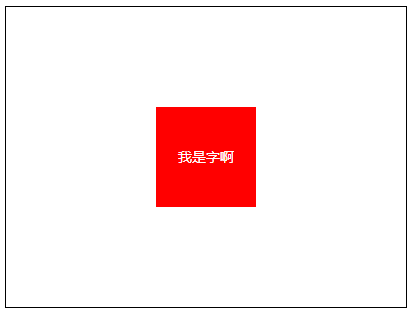 文本水平垂直剧中
另:未知宽度下实现元素的水平居中:所需元素display:table margin:0 auto;
文章来源:知乎-前端进击者


网友评论