Typographical Concepts
This chapter defines some important typographical concepts relevant to the text system. Many of the terms representing these concepts are reflected in text system APIs. If you’re familiar with typography, you can skip this chapter.
本章定义了与文本系统相关的一些重要的排版概念。 这些概念的许多术语都反映在文本系统API中。 如果您熟悉排版,可以跳过本章。
Characters and Glyphs(字符和字形)
A character is the smallest unit of written language that carries meaning. Characters can correspond to a particular sound in the spoken form of the language, as do the letters of the roman alphabet; they can represent entire words, such as Chinese ideographs; or they can represent independent concepts, such as mathematical symbols. In every case, however, a character is an abstract concept.
一个字符是有一定含义的书面语言的最小单位。 字符可以指某种语言的发音,如拉丁字母;它可以代表整个词,如中国表意文字; 或者它也可以表示独立的概念,例如数学符号。 无论在何种情况下,字符都是一个抽象的概念。
Although characters must be represented in a display area by a recognizable shape, they are not identical to that shape. That is, a character can be drawn in various forms and remain the same character. For example, an “uppercase A” character can be drawn with a different size or a different stroke thickness, it can lean or be vertical, and it can have certain optional variations in form, such as serifs. Any one of these various concrete forms of a character is called a glyph. Figure 2-1 shows different glyphs that all represent the character “uppercase A.”
虽然字符必须通过可识别的形状在显示区域中表示,但它们的形状不同。 也就是说,可以以各种形式来绘制同一个字符。 例如,可以使用不同大小或不同行程厚度绘制“大写A”字符,它可以倾斜或垂直,并且可以在形式上具有某些可选的变体,例如衬线。 字符的这些各种具体形式中的任何一个称为字形。 图2-1显示了所有表示字符“大写A”的不同字形。
 Figure 2-4 Glyph metrics
By default, in horizontal text, typesetters place glyphs side-by-side using the advance width, resulting in a standard interglyph space. However, in some combinations, text is made more readable by kerning, which is shrinking or stretching the space between two glyphs. A very common example of kerning occurs between an uppercase W and uppercase A, as shown in Figure 2-5. Type designers include kerning information in the metrics for a font. The text system provides methods to turn kerning off, use the default settings provided with the font, or tighten or loosen the kerning throughout a selection of text.
默认情况下,在水平文本中,排版器使用前进宽度并排放置字形,被称作标准的间隔空间。 然而,在某些组合中,通过字距调整使文本变得更加易读,字距缩小或缩小两个字形之间的空间。 字母间距的一个很常见的例子是在大写字母W和大写字母A之间发生,如图2-5所示。 类型设计师包括字体指标中的字距信息。 文本系统提供关闭字距的方法,使用字体提供的默认设置,或在整个文本选择中收紧或松开字距。
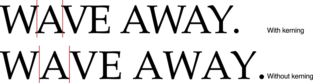 Figure 2-5 Kerning字距
Type systems usually measure font metrics in units called points, which measure exactly 72 per inch in most computer typesetting systems. Adding the distance of the ascent and the descent of a font provides the font’s point size.
类型系统通常以单位称为单位测量字体度量,在大多数计算机排版系统中,这些单位的测量精确为每英寸72。 添加上升和下降字体的距离可以提供字体的点大小。
Space added during typesetting between lines of type is called leading, after the slugs of lead used for that purpose in traditional metal-type page layout. The total amount of ascent plus descent plus leading provides a font’s line height. (Leading is sometimes also called linegap. It is often specified as a ratio of a font’s point size over the line height at which a block of text is set, such as 14/16.5.)
在排版之间添加的空间类型称为引导,在传统金属类页面布局中用于此目的的铅笔。上升加下降加前导的总量提供字体的行高。 (引导有时也称为线间隙,通常被指定为字体的点大小与设置文本块的行高度的比例,例如14 / 16.5)。
Although the preceding typographic concepts of type design may be somewhat esoteric, most people who have created documents on a computer or typewriter are familiar with the elements of text layout on a page. For example, the margins are the areas of white space between the edges of the page and the text area where the layout engine places glyphs. Alignment describes the way text lines are placed relative to the margins. For example, horizontal text can be aligned right, left, or centered, as shown in Figure 2-6.
虽然上述类型设计的排版概念可能有些深奥,但大多数在计算机或打字机上创建文档的人都熟悉页面上文本布局的元素。例如,边距是页面边缘与布局引擎放置字形的文本区域之间的空白区域。对齐方式描述文本行相对于边距放置的方式。例如,水平文本可以右对齐,左对齐或居中对齐,如图2-6所示。
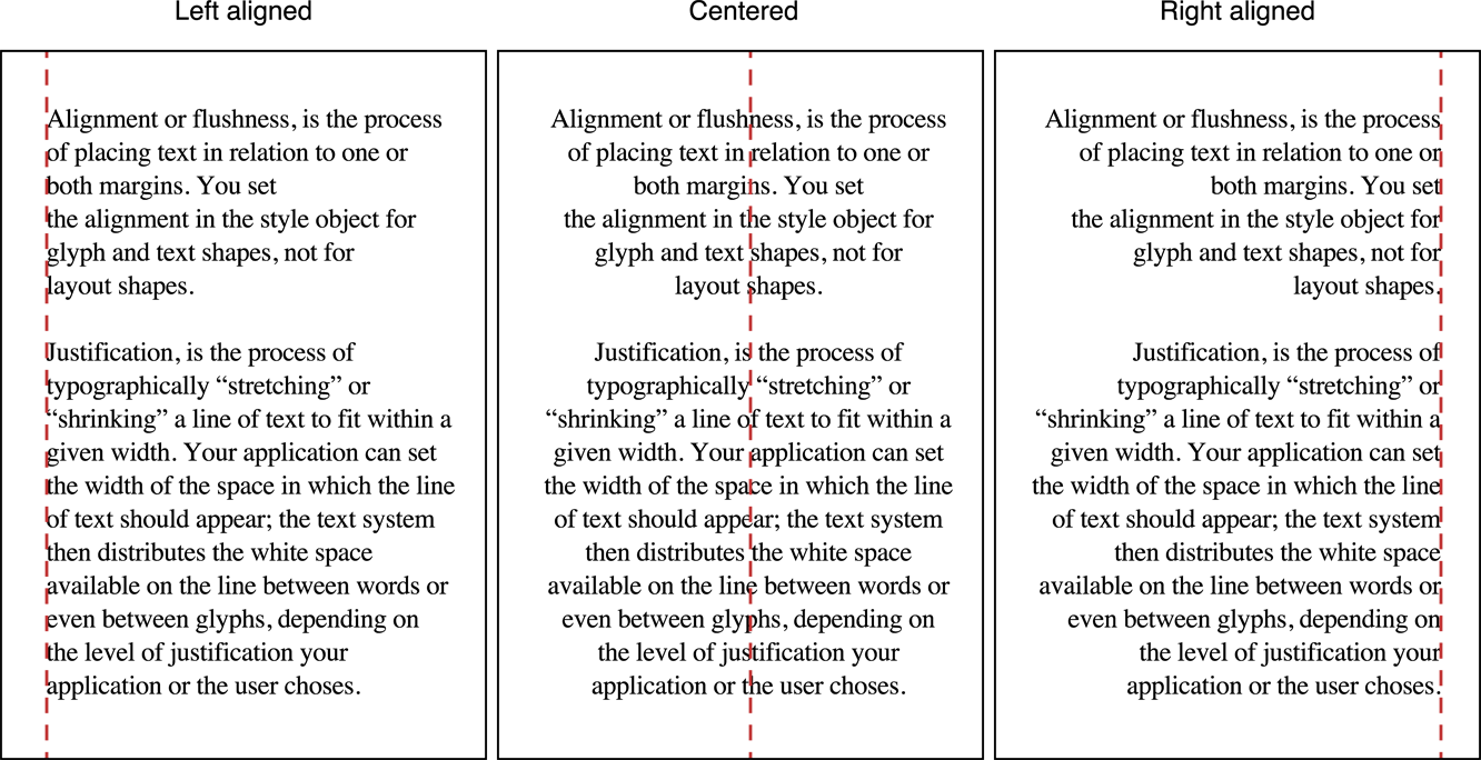 Figure 2-6 Alignment of text relative to margins
Lines of text can also be justified; for horizontal text the lines are aligned on both right and left margin by varying interword and interglyph spacing, as shown in Figure 2-7. The system performs alignment and justification, if requested, after the text stream has been broken into lines and hyphens added and other glyph substitutions made.
文本行也可以是正当的;对于水平文本,线条通过改变左右边距和间距间隔来对齐左右边距,如图2-7所示。在文本流被分解成行和连字符之后,如果需要,系统执行对齐和对齐,并进行其他字形替换。
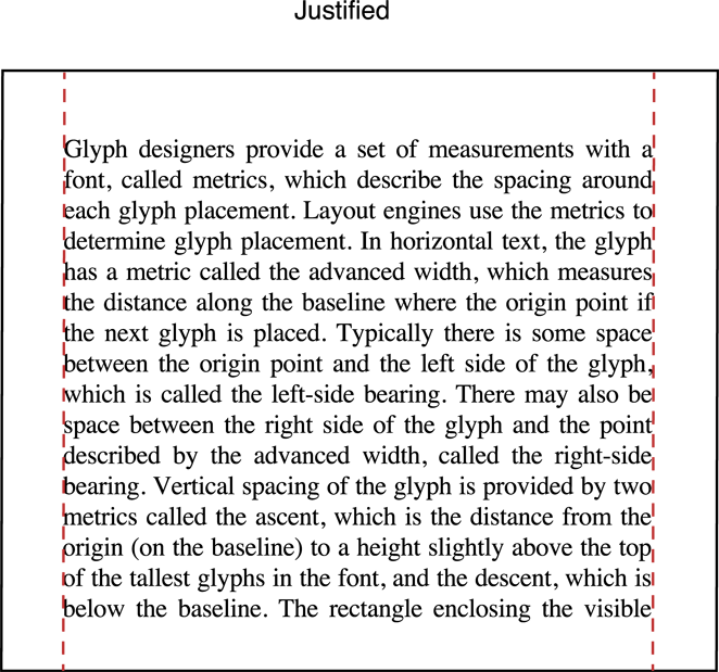 Figure 2-7 Justified text


网友评论